Ahhh, tax season. It used to be that time of year that you handed a giant folder over to your accountant – not merely for convenience but because he actually knows how to navigate the complexity of tax forms. Until, that is, TurboTax reimagined the tax experience, empowering millions of consumers to complete their taxes all on their own.
TurboTax has transformed the tax return process from being an obligation I once dreaded to something I am personally invested in and look forward to each year.
While completing my own taxes on TurboTax this year, I considered 3 parallels to reimagining the patient experience:
1. Make it personal
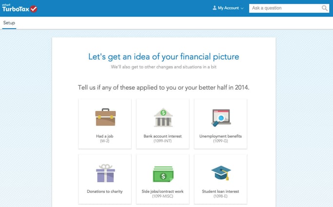
One of my favorite TurboTax features is that a simple prompt, “click here if this applies to you,” customizes your experience so that you only have to answer questions that are relevant. From there, it personalizes the actual experience based on my unique needs.
In healthcare, we’re already seeing greater strides towards this type of personalization. For instance, consumers that log into Epic myChart are able to view a personalized list of appointments they need to schedule – from their annual physical to getting their flu shot. The list dynamically updates as appointments are scheduled and completed.
Some health systems have even found ways to personalize experiences that you wouldn’t normally think could be. Take quality and safety data for example. Many hospital websites report their mortality rates, medical error rates, and other measures of quality. With thousands of potential data points, which ones should a consumer pay attention to?
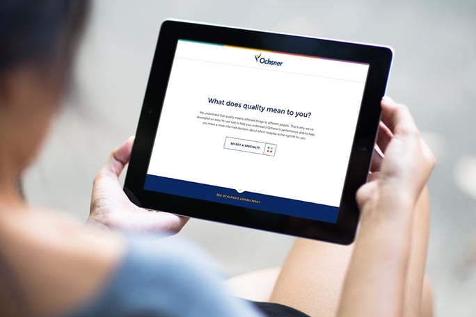
As Ochsner Health System learned through primary B2Me research, consumers have different definitions of what contributes to hospital quality. A personalized quality and safety data experience was just the right solution. We helped Ochsner develop an interactive online tool that lets consumers indicate the quality categories they care most about – from satisfaction to recovery to a specific specialty like transplant – and returns a customized report of the specific quality measures that are most relevant.
2. Use game mechanics to promote understanding
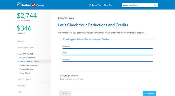
As I prepare my taxes every year, I constantly ask myself, “how much am I going to have to pay or (hopefully) how much will I get back?” What does this all mean? TurboTax has embraced the idea that completing your tax return is just a means to an end – proudly displaying (and adjusting) your total refund amount as you move through your return. Every step of the way, it’s motivation to keep going and fill out more information to see if you can get the number to go up.
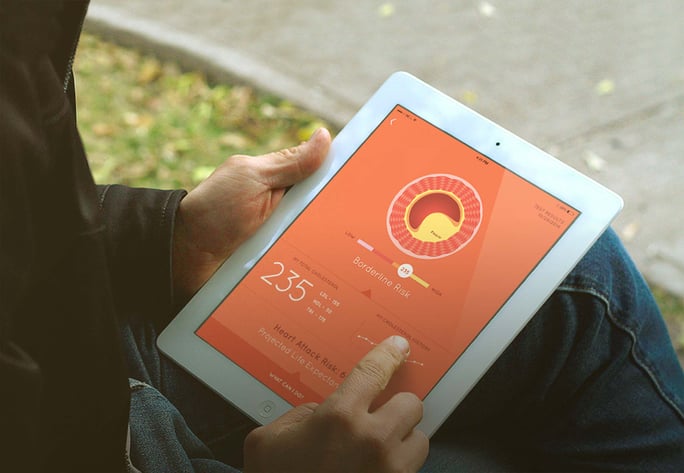
In healthcare, it’s all-too common for patients to ask “what does this all mean?” How many patients have received their blood test results and didn’t know what to make of their cholesterol levels? An arbitrary number accompanied by a flag of “high” doesn’t really tell a consumer how clogged their arteries are or what to do about it. With a little information design and data visualization, the lab report could be a much more gamified and impactful experience. Instead of just a number, consumers could see a visual representation of just how clogged their artery may be – plus their associated heart attack risk. And, it could be gamified by letting users “play” with specific lifestyle changes and the resulting impact on their quality of life.
3. Keep it seamless
One of the most frustrating parts of doing your taxes is fumbling through documents sent to you by the government, your banks and investment accounts, and other sources, then manually entering them into a form. TurboTax removes much of that frustration by letting users securely enter account user names and passwords and then, voila, your TD Ameritrade stock information is automatically completed for you. Its relationship with many payroll providers means that most W-2s can automatically be filled in as well. TurboTax has all but eliminated the constant back and forth between disparate information sources.
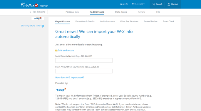
The healthcare industry could use some of this streamlining. Epic has already begun to recognize this need by connecting patients’ myChart portal access across multiple providers.
There’s even a new Center for Medical Interoperability dedicated to accelerating the move towards a seamless exchange of information into and out of the electronic health record. And with that, we look forward to a more seamless consumer experience like the day your trip to the urgent care center is automatically followed up with an email from your primary care physician. Or when the patient portal and hospital website are the same experience.
You don’t go to Amazon.com to search for something and then log into a completely different site to purchase it or manage your returns. Which brings us back to personalization. If the patient portal were truly a “logged-in” version of a hospital website (rather than a login button that takes you to a different experience), it might even motivate the patients to log on to the portal more often. Once logged in, existing patients could receive a more personalized website experience that serves up the specialty pages, content, and news most relevant to their medical history and needs.


